Brand identity for start-up game studio Matero Games.
A haiku [ my first and perhaps last 😀 ] to try and encapsulate the origins of this brand name…
From Belfast to Temuco
Inspired creative thinking
Matero Games
Barry’s idea to start this company was drawn from his travels in South America, particularly when partaking in the at-once social and contemplative ritual of drinking of mate.
Mate is an infusion – similar in many respects to tea – that’s particularly popular in Argentina and Uruguay. The matero is a gourd-and-bombilla combo used to drink mate. (The bombilla is a type of drinking straw – often silver, usually metal.) Quite simply we had to incorporate a matero (both elements) into the logo. As well as the backstory he had a first prototype game: Tessary. A platform-jumper using different flat geometric designs for the level-maps. The first level was based on a triangular grid pattern. You can see where I went with this…
The Full Matero Games Brand Guidelines
(Minus cover pages)
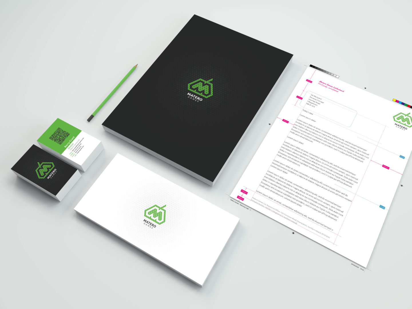
Actual Stationery Looks Like This
Bonus Material #1 – Matero Games Brand Motifs
Because you can’t always just “drop a logo on it”…
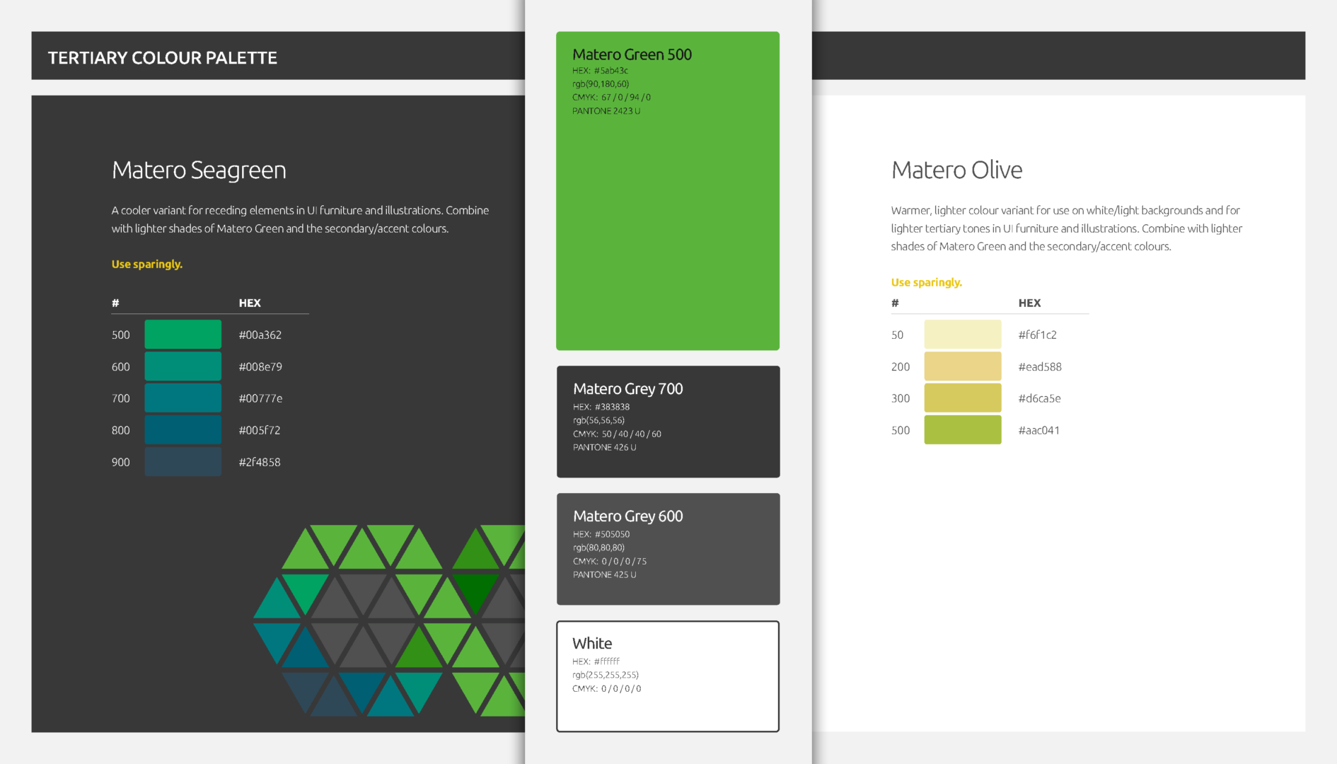
Bonus Material #2 – Matero Games Tertiary Colour Scheme
Matero Logo sketches
Despite having a fairly clear idea for the logo – and that it would actually be most efficient to develop directly using software (Adobe Illustrator) – it was important to explore some alternatives…
Last updated on 3rd January 2024


Leave a Reply