
A very handy little CMYK colour guide in 36 pages.
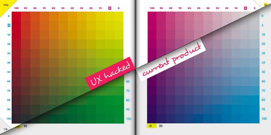
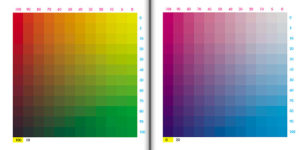
Square-cut A5, 170gsm silk art paper. Each page has a 12×12 matrix of cyan against magenta. Each cyan/magenta axis is stepped in 10% increments from from 0-100% (plus an extra stop at 5%).
Each page adds a set amount of yellow and/or black in 20% steps for yellow and 10% steps (unto 50%) for black.
That’s a total of 5,184 swatches.
Not cheap for the format at nearly £20 including shipping to Spain but compared to 150 smackers for a Pantone CMYK Color Guide – it’s a positive bargain.
For me, it’s a very handy little printed reference.
There’s a couple of things I’d fix in the UX though…
Getting stuff out of the gutter.
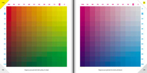
Rather than always on the right-hand side, I’d consider moving the magenta axis away from the gutter and onto the outside edge of the page (LHS on left-hand pages). Better for visibility when flicking through.
More importantly, the same goes for the Yellow and Black mix constants. This mix is the primary difference between the pages and needs to be very clear. Biggerizing its impact by moving to the corners and adding the relevant tint behind would improve the visual hierarchy and would help greatly when flipping through.
The 5% step. This step needs to stand out as the odd one out – all the others are 10% steps – it’s a small but important fact so must be obvious. I suggest reversing the text out to make a small label there.
Lastly – I’d consider adding a text title to each page. Just to make each page understandable if taken out of context.
(Oh – you should also spank your printer they’ve not accounted for the near 4mm of creep. But that’s nitpicking now.)
Get yourself some CMYK guidance
As with most things – once you’ve used it a couple of times you get used to the format. [Paul, if you’re interested, you’re free to use any my suggestions in the next edition 😉 .] So get yourself the perfectly good first edition CMYK bible [everybody loves a first edition] from the good folks at hellocolour.co.uk.
Leave a Reply